

Key Takeaways
- Process Standardization: Synchronizing machine temperature, pressure, and speed creates a stable printing environment that minimizes color deviation across high-speed gravure runs, ensuring the final output maintains a consistently low Delta E measurement.
- Ink Rheology Control: Precise management of ink viscosity through controlled storage and real-time monitoring prevents fluctuations in color saturation and film thickness, which is vital for achieving uniform branding across complex multi-layer laminates.
- Substrate Influence: The selection of outer-layer materials such as BOPP versus PET fundamentally alters light reflection and ink absorption, necessitating material-specific prepress adjustments to ensure visual color consistency across different packaging structures.
- Objective Measurement: Replacing subjective visual assessment with spectrophotometer-based Delta E tracking allows for the establishment of quantifiable quality standards, reducing brand risk by ensuring color accuracy remains within tight tolerances during massive production cycles.
- Specialty Finish Calibration: Applying colors to matte finishes or metallic foil substrates requires specific ink adhesion protocols to manage unique reflective properties that can otherwise distort perceived color depth and brand identity accuracy.
Introduction
Batch-to-batch color variation frequently leads to rejected shipments and a perceived loss of product quality, making finished goods appear inconsistent or even counterfeit to the end consumer. Achieving reliable color consistency in packaging printing requires moving beyond subjective visual checks to address the underlying physical variables that cause deviation during high-speed production. When color accuracy falls outside of acceptable tolerances, the resulting brand damage and supply chain waste can outweigh any initial savings on material or ink costs.
The stability of a printing environment depends on the precise synchronization of ink chemistry and mechanical settings. Variables such as ink viscosity control and the substrate color influence of materials like BOPP or PET fundamentally alter how light reflects and how pigments bond to the surface. Without standardized machine temperature, pressure, and speed, even premium inks can yield different results across separate shifts. Modern quality control necessitates moving from the Pantone Matching System toward a spectrophotometer in packaging to provide an objective Delta E measurement throughout the entire production run. Identifying critical control points helps mitigate brand risk and ensure visual uniformity across complex packaging structures.
The Physics of Color Consistency in Packaging Printing
The maintenance of color consistency in high-volume packaging production is a rigorous application of fluid dynamics, thermodynamics, and mechanical engineering. In an industrial context, color is the visual manifestation of a controlled ink film thickness deposited onto a moving substrate. Achieving a low Delta E across millions of units requires the synchronization of three primary physical variables: Temperature, Pressure, and Speed (T-P-S).

When these variables fluctuate, the physical properties of the ink and the mechanical behavior of the printing press change, leading to color drift.
The relationship between machine speed and color density is rooted in the centrifugal force exerted on the ink within the cells of a gravure cylinder. As the speed increases, the time available for the doctor blade to wipe the cylinder surface decreases, and the hydraulic pressure of the ink against the blade increases. If the mechanical tension of the blade is not adjusted to compensate for this hydrodynamic lift, a thicker film of ink is left on the cylinder, resulting in a darker, more saturated color. Conversely, at excessively high speeds, the cell emptying efficiency may drop because the ink does not have sufficient time to transfer from the microscopic gravure cells to the substrate via capillary action, creating a graying effect where the color loses its intended depth.
Pressure is the second pillar of this triad. In flexible packaging, pressure dictates Dot Gain, which is the physical deformation of the ink droplet upon contact with the substrate. When the impression roller exerts force, the ink is squeezed outward. If the pressure is too high, the dots of a halftone screen expand beyond their calculated area, shifting the hue toward the darker end of the spectrum. If the pressure is too low, the transfer is incomplete, leading to pinholing or snowflaking. Utilizing a gravure-printed high-barrier pouch requires a press capable of maintaining micron-level pressure stability across the entire web width to ensure that the dot gain remains constant throughout the run.
Temperature serves as the master regulator of ink viscosity and solvent evaporation. In a typical gravure or flexographic environment, the friction of the mechanical components and the recirculation of ink generate heat. As the temperature rises, the viscosity of the ink drops, which can lead to excessive spreading and a loss of color sharpness. Simultaneously, higher temperatures accelerate the evaporation of solvents, which increases the pigment concentration in the remaining ink. Without standardized thermal management, the chemical composition of the ink changes continuously.
Synchronizing Mechanical Variables for High-Speed Stability
Achieving stability in a 24-hour production cycle requires moving beyond fixed parameters. Mechanical vibration is a primary cause of color inconsistency in older or poorly maintained equipment. As the press vibrates, the distance between the gravure cylinder and the impression roller oscillates, causing cyclical variations in pressure. These variations manifest as banding or chatter marks in the print, where the color density fluctuates in a rhythmic pattern. Standardization involves the use of anti-vibration mountings and real-time electronic monitoring of roller alignment to ensure that the mechanical geometry of the press remains rigid.
The transition from startup speed to full production speed is a critical window for color accuracy. During acceleration, the T-P-S balance is in flux. Advanced printing systems use speed-compensated ink dosing and pressure adjustment systems. These systems automatically increase the impression force and adjust the doctor blade angle as the linear velocity of the substrate increases. Auditing the ability to manage this ramp-up phase is essential, as many color deviations occur in the rolls produced during the initial stages of a run.
Heat and Pressure: Managing Ink Transfer and Dot Gain
The interface between the doctor blade, the gravure cylinder, and the substrate is where the color is finalized. The doctor blade must maintain a precise angle of attack—typically between 55 and 65 degrees. If the blade wears down or the angle shifts due to thermal expansion of the mounting hardware, the wipe becomes inconsistent. A worn blade allows a scum of ink to remain on the non-image areas of the cylinder, which subtly shifts the background color, a phenomenon known as toning.
Thermal expansion of the rollers must also be accounted for. In long-run orders, the steel core of a printing cylinder can expand as it reaches an equilibrium temperature. This is sufficient to alter the pressure balance and the dot gain profile. High-end facilities utilize water-cooled rollers to maintain a constant surface temperature, ensuring that the physical dimensions of the printing interface remain static regardless of the ambient environment or the duration of the run.
Table 1: Printing Variable Correlation Matrix (Qualitative Impact)
| Variable Change | Impact on Ink Viscosity | Impact on Dot Gain | Resulting Color Shift | Required Correction |
|---|---|---|---|---|
| Increase Speed | Decrease (Shear Thinning) | Increase (Dynamic) | Darker/Heavier | Increase Blade Pressure |
| Increase Temperature | Decrease (Thermal) | Increase (Flow) | Shift in Hue/Saturation | Add Fresh Solvent/Cooling |
| Increase Pressure | No Change | Significant Increase | Darker/Loss of Detail | Reduce Impression Force |
| Decrease Solvent | Increase | Decrease | “Muddy” or Flat Color | Add Balanced Thinner |
Beyond Subjectivity: Leveraging Delta E Measurement and Spectrophotometers
Relying on visual matching against a master sample is flawed because human color perception is subjective and influenced by fatigue, age, and lighting conditions. True consistency requires the use of spectrophotometers and the Delta E (dE) metric. A spectrophotometer measures the spectral reflectance of a surface across the visible spectrum, providing a mathematical fingerprint of the color that is independent of the observer.
Delta E is the calculated distance between two colors in a three-dimensional color space (CIELAB). In this space, L represents lightness, a represents the red-green axis, and b represents the yellow-blue axis. A Delta E of 0.0 is a perfect match. In industrial packaging, a Delta E of less than 2.0 is generally the threshold for acceptable commercial consistency, while high-tier brands often demand a Delta E of less than 1.0 for primary brand colors. These numbers provide an objective basis for quality standards.
The shift from density measurement to spectral measurement is a key technological improvement. While older densitometers only measured the thickness of the ink layer, a spectrophotometer identifies specific wavelength shifts. This is critical when using the Pantone Matching System or custom spot colors. For example, a brand color might have the correct density but a slight yellow shift due to the substrate’s base tint. A spectrophotometer flags the b-value deviation immediately, allowing the operator to adjust the ink formulation mid-run.
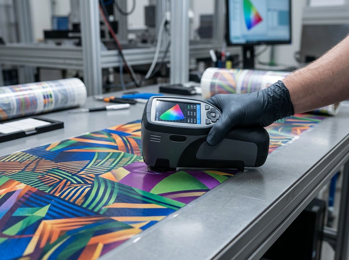
Quantifying Deviation with a Spectrophotometer in Packaging
The implementation of spectrophotometry begins in the ink lab. Before an ink batch reaches the press, a drawdown is performed on the specific substrate intended for the order and measured against a digital master file. This digital approach is superior to physical swatches, which can fade over time due to UV exposure and oxidation. By comparing production to a digital standard, the process ensures that repeat runs remain identical to the original specification.
During the production run, samples are taken at regular intervals and scanned to log the resulting Delta E. This data provides a trend analysis. If the Delta E starts to creep toward the tolerance limit, the system alerts the operator to adjust ink viscosity or temperature before the product fails inspection. This predictive color management is a sign of process maturity.
Establishing Prepress Color Management Standards
Color consistency begins with the creation of ICC (International Color Consortium) profiles that characterize the specific combination of press, ink, and substrate. If switching from a PET-based structure to a BOPP-laminated functional packaging solution, the prepress department must adjust color separations to account for the different refractive indices and whiteness levels of the new film.
Standardization also requires control over the viewing environment. The industry standard for color evaluation is D50 or D65. A package that appears correct under factory floor LEDs may look different under the warm lights of a retail shelf. Standardized light boxes ensure that both the manufacturer and the buyer are evaluating the product under identical spectral conditions.
Ink Rheology and Real-Time Viscosity Control
Ink viscosity is a volatile variable and a primary cause of color inconsistency. In gravure and flexographic printing, ink is a mixture of pigments, resins, and volatile solvents. As the press operates, solvents evaporate, increasing the concentration of pigment and causing the ink to become more viscous. High-viscosity ink does not flow easily into or out of the gravure cells, leading to muddy colors and an increase in Delta E.
Manual viscosity control using a Zahn cup is often insufficient for high-speed production because the viscosity can drift significantly between checks. Automated viscosity control systems use sensors to monitor the ink in real-time.

When a shift is detected, the system injects a precise amount of solvent to maintain the ink at a constant rheological state.
Furthermore, the rheology of ink is non-Newtonian, meaning its viscosity changes based on press speed. A standardized process must define the running viscosity for specific speeds. If the press slows down, the ink may thicken momentarily, causing a color shift. Understanding these chemical boundaries is essential for maintaining consistency across different machines or shifts.
The Correlation Between Viscosity and Color Saturation
There is a direct relationship between viscosity and the Ink Film Thickness (IFT) deposited on the substrate. A higher viscosity results in a thicker IFT. Because pigment particles are more densely packed in a thicker film, light absorption increases, making the color appear darker. In technical terms, the L value in the CIELAB space decreases.
Viscosity also affects trapping—the ability of one ink layer to adhere to a previously printed, wet layer. In multi-color printing, if the viscosity of the second color is not lower than the first, the second color will not transfer properly, leading to mottling. Solvent balance is critical to control the drying rate and surface tension of the ink film for effective overprinting.
Storage and Environmental Stabilization of Pigment Systems
Ink stability begins with proper storage. Pigment particles are prone to sedimentation or flocculation if not handled correctly. Standardized protocols require mechanical agitators to ensure ink is homogenized before it is loaded into the press.
The ambient environment also plays a role. In high-humidity settings, certain solvents can absorb water from the air. This contamination changes the solubility of resins, which can alter the color. Climate-controlled ink rooms and sealed delivery systems are standard requirements for maintaining color across different seasons and geographic locations.
Substrate Color Influence: Managing Variance Across BOPP and PET
The substrate is an active participant in final color appearance. In flexible packaging, the background color of the film, its transparency, and its surface energy all dictate how ink is perceived. A clear PET film from different sources may have different haze values or subtle tints, acting as a filter for light passing through the ink.
Surface energy, measured in Dynes/cm, determines the wetting of the ink. If the surface energy is too low, the ink will bead up, leading to poor color density. Standardized processes require corona treatment of the film immediately before printing to reach a target level. Inconsistent surface energy across the web causes uneven color even if press settings are accurate.
When utilizing BOPP-laminated functional packaging, the sandwich effect of the lamination process must be considered. In a typical structure, the color is viewed through the outer layer. The adhesive layer and secondary films can shift the color. If a secondary layer varies in thickness, the opacity of the background changes, affecting the perceived brightness of the printed color.
Light Reflection and Absorption Profiles of Plastic Films
The physics of color in packaging is governed by subsurface scattering. Light penetrates the outer film, passes through the ink, reflects off the base layer, and passes back through the ink.

Every layer absorbs or refracts certain wavelengths.
BOPP has a different refractive index than PET. A red ink printed on PET will look slightly different than the same ink on BOPP due to differences in clarity and haze. Prepress engineers must create substrate-specific color profiles, calibrating the pigment load for the optical profile of the target material.
Adhesion and Opacity in Multi-Layer Laminates
In many flexible packaging designs, a white base layer is printed first to provide a neutral background. The opacity of this layer is the foundation of color consistency. If the white ink is too thin, the color of the contents or the foil layer will show through, darkening the final image.
Standardization of white opacity is measured using a densitometer. A deviation in white opacity can lead to significant Delta E shifts in overprinted colors. Therefore, white ink must be managed with the same rigor as primary brand colors, especially in high-barrier structures where dark layers can dull the visual output.
Technical Strategies for Color Consistency in Packaging Printing with Specialty Finishes
Specialty finishes, such as matte coatings and metallic foils, introduce complexity to color management. A matte finish uses agents to create a microscopically rough surface that causes diffuse reflection. This scattering makes colors appear flatter and less saturated than on glossy surfaces.
When producing a custom matte foil laminate pouch, the challenge is to maintain brand accuracy on a surface that absorbs visual impact. Ink formulations may require a higher pigment-to-binder ratio to ensure vibrancy, though this must be balanced with adhesion and durability. Standardization involves finding the precise balance that achieves the matte aesthetic without sacrificing color stability.
Metallic substrates act as a mirror, requiring transparent inks to allow the luster to shine through. If the ink is too opaque, it appears flat; if it is too transparent, the metallic reflection overpowers the hue. Achieving consistency on foil requires precision in the cell volume of the gravure cylinder to ensure the microscopic layer of transparent ink is uniform.
Controlling Perceived Depth on Matte Surfaces
Matte surfaces are prone to burnishing, where friction smooths out the surface roughness and creates shiny spots. These spots appear to be a different color. To prevent this, manufacturers use hardened matte lacquers with additives that reduce friction.
In terms of measurement, matte surfaces require specific spectrophotometer settings. Because the surface is non-reflective, spherical (d/8) spectrophotometers are used to capture Specular Component Included (SCI) data. This ensures the instrument measures the total color of the pigment rather than just the light scattered by the texture.
Managing Metallic Substrate Reflectivity and Ink Opacity
When printing on a metallic structure, the reflection path is doubled as light travels through the ink twice. Small variations in ink thickness have a significant effect on the final color. A one-micron variation that might be invisible on a white substrate can cause a large color shift on metallic foil.
To manage this, manufacturers use ink weight testing alongside Delta E. By verifying the weight of the ink residue from a known area, the press can be adjusted to deliver the exact volume required for color integrity. For a custom matte foil laminate pouch, this ensures the metallic-matte appearance is consistent across production lots.
Standardization as a Procurement Strategy: Assessing Supplier Maturity
Color consistency is a data-driven output of a standardized system. When auditing a facility, the focus should be on the ability to replicate parameters from previous successful runs. A setup sheet that lists exact viscosity, temperature, machine speed, and doctor blade angle is essential for reliable production.
Digital Color Library integration is another indicator of maturity. Instead of matching to a physical sample, the process should match to a Color Exchange Format (CxF) file containing spectral data. This digital standard is more stable than physical swatches and allows for consistent results over long periods.
The total cost of packaging is influenced by color consistency. While standardized processes may involve higher setup costs for calibration, the reduction in failure costs—such as returns and re-runs—is significant. Consistent Delta E protects brand equity by ensuring a professional appearance on the retail shelf.
Evaluating Digital Color Management Systems
A technical audit should address several key points:
- Automated Viscosity Control: The presence of AVC on every deck ensures consistency in long runs.
- Spectrophotometer Calibration: Instruments must be calibrated against a standard daily to prevent drift.
- Ink Dispensing: Automated systems for blending inks ensure virgin-quality color is maintained.
- Cylinder Maintenance: Tracking the revolutions of gravure cylinders and re-engraving before they fall out of specification prevents pressure and transfer issues.
The Hidden Costs of Color Inconsistency
Color variation is often perceived by consumers as a sign of poor quality or compromised product integrity. For high-value goods, this can impact brand loyalty. Operationally, color drift leads to waste during press adjustments, which is eventually reflected in the production cost. Choosing a supplier that uses standardized T-P-S controls and digital measurement creates a more predictable and optimized supply chain.
Table 2: Packaging Color Management Maturity Model
| Maturity Level | Measurement Method | Viscosity Control | Process Variables (T-P-S) | Brand Risk |
|---|---|---|---|---|
| Level 1 | Human Eye / Visual Match | Manual (Zahn Cup) | Subjective | High |
| Level 2 | Densitometer (CMYK) | Semi-Auto (Timed) | Documented but loose | Medium |
| Level 3 | Spectrophotometer (Delta E) | Full Auto (Real-time) | Standardized Set-points | Low |
| Level 4 | Cloud-based Digital Color (CxF) | Fully Integrated | Closed-loop Control | Negligible |
Conclusion
Achieving consistent color in high-volume packaging requires a shift from subjective visual matching to a data-driven framework centered on printing press physics. Long-term standardization depends on the precise synchronization of ink viscosity, machine speed, and mechanical pressure to maintain stable dot gain and acceptable Delta E values. For procurement managers, auditing a supplier’s ability to manage these variables through automated control systems and spectral measurement is essential for mitigating brand risk and reducing failure costs. Adopting digital color standards ensures visual integrity is maintained across diverse substrates and complex laminate structures. To discuss specific barrier requirements or color management protocols for a product line, consult the technical team.


0 Comments